Lead generation is a lengthy process. If this is an area you want to get into, there is a lot more to learn. I will be going over some basic skills to help with the lead generation process. I won’t be discussing the different ways you can generate leads, such as email, social media, cold calling etc.
The techniques I have listed to improve your skills will not involve any of the outreach – they are simply different ways you can improve your site.
If you want to further your knowledge, there are many technicalities, such as understanding the lead generation funnel.
Let’s go ahead and get started with these simple techniques you can use.
9 Ways to Improve your Lead Generation Skills

Source: Intelliverse
You don’t have to understand the funnel for this article, but we will talk about improving your CTAs and landing page. These skills are helpful to have before starting the lead generation process.
Improve your Calls-To-Action

Here, I will talk specifically about how to improve your CTA. This can be applied to any approach such as social media, emails, messages, etc.
Having a clear CTA
With any approach, you want to have a clear and compelling offer. If you are getting leads from social media (where people haven’t heard about your company), you have to have a CTA that best represents your company.
This should include what you are offering and the benefit of the offer. If you simply state “Free Guide!” What is the free guide for?
The reader knows what your offering but doesn’t know what it is for and its benefits. Instead, you should say “Free Guide to Crocheting.” Crocheting is an example, but you wouldn’t have known what the guide was for until I shared it.
This makes your message clear and is more likely to get someone to react with your CTA.
Use Images and Colors

If your email or blog is nothing but text, then you are missing out on leads! It is essential to have images and colours to grab attention.
You can do this with your CTA to make it more noticeable. It will immediately get the attention of potential leads where they can decide to interact or not.
Hyperlink to the Landing Page
This one often gets forgotten, and it is crucial! When I receive emails from online stores, I see their CTA, but sometimes there’s no link or button. I would have to search the website myself or access it from a different link in the email.
If they have a link, but it doesn’t correspond with the CTA, I can never find what they offer on the site!
As you can see, that is very frustrating, and people don’t have time to search for the CTA. A corresponding link should be on any social media posts and emails that you share with your CTA.
CTA Placements
Once you have a clear offer, you want to place the CTAs in all the right places on your website. Have your CTA match with a specific blog post or page.
You don’t want multiple offers on the same page if it doesn’t make sense. For example, if you say, “ 50% off women’s clothing”, then you don’t want that on a page for men’s clothing.
For CTAs that are for specific categories, only place those on content that matches.
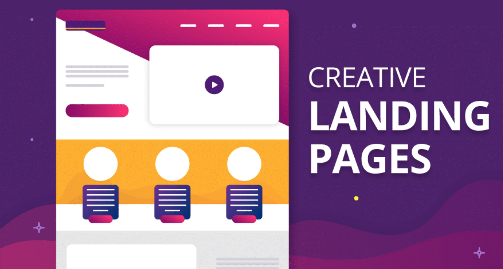
Improve Landing Pages

Now we can focus on the landing page where your CTA takes you. You have the users attention, and we don’t want to lose them. Here are some ways to improve your landing pages and keep your users engaged.
Match the Headline and CTA
After making your CTA clear, we want to make sure there is no room for confusion. This goes back to the CTA placement. We want everything to correspond.
If headlines are different from the CTA, users might think that the CTA doesn’t exist or there are some disorganisation issues. After seeing this, users often lose respect for the company.
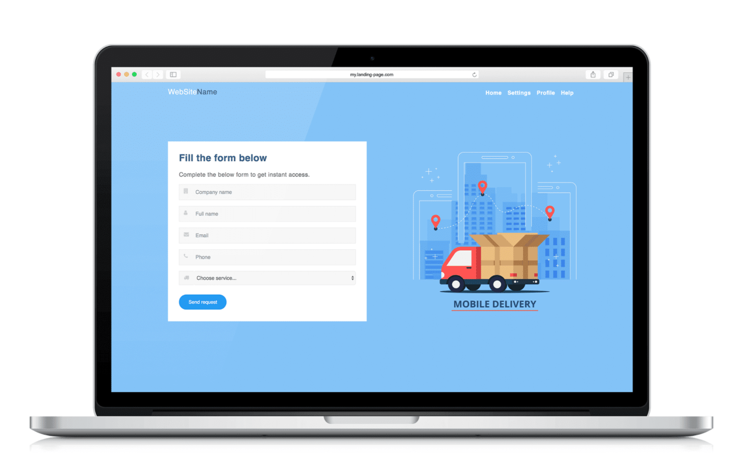
Add a Form

Source: teamgate
Let’s say the user clicked on your CTA; what now? It takes them to a landing page with what?
It is common to use a form depending on what your CTA is. Do not use a form if it’s not necessary.
If you are interested in using a form, then make sure it is super simple. If it is too complex, it starts to feel like a survey, and the user begins to lose excitement.
Easy texts and Images
A great way to keep the user engaged is to add images! I said this earlier for your CTA, and now is not the time to forget. If the user sees a very plain page, they might think that they are at the wrong place.
- Keep your paragraphs short, and this will help your landing page look much more attractive.
- Match the landing page with the CTA, email, or blog, so the energy is consistent throughout.
Emphasise Benefits

On the landing page, you want to list or explain the benefits of the CTA briefly. This adds more clarity.
Seeing the benefits helps the user decide to interact with your CTA.
Confirmation Pages
Now imagine that the user followed through with the offer, clicked on your CTA, filled out your form, and submitted it. What would they expect next?
A confirmation message! This is very important. If the user doesn’t see a confirmation message, they may put multiple submissions that aren’t needed.
It’s common to see some sort of confirmation when you submit any kind of information. Don’t forget the following.
- Add a confirmation page.
- Mention thank you on the confirmation page or email
- The page should reflect the same energy that you have been using.
Conclusion
Those were just a few ways you can improve your lead generation skills. There is so much more such as email campaigns and understanding the lead generation funnel.
These practices are still an excellent place to start with the basics.


